Monday, October 13, 2008

Challenge #4 Guest Designer LINDA HARRISON challenges you


I am so honored to not only have Linda as a contributor for When Life Gives You Lemons but I feel so grateful to also call her a friend. She is an incredibly talented scrapbooker and you can see more of her work on her blog. You will also be able to see her gorgeous layouts in a number of idea books and magazines but specifically her OWN book; Starting Points.


I asked Linda to help us with a challenge this week and she stepped right up to the challenge and offered us some REALLY neat inspiration....


Here you can see her "Lemon" photo was a picture of her adorable son, Robby riding his bike. Naturally, you can see that his head is cut off at the top and the movement of the bike made it a tad blurry. Coupled with the fact that her husbands shoe is visible in the lower right corner but no body visible.
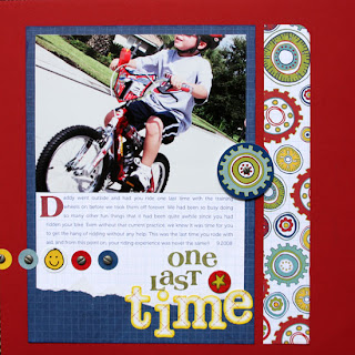

I want you to find a photo that wasn't 'framed' properly and use it as is to tell the story behind the photo. Somebody's head is cut off or maybe a portion of their body. Try to use this photo as it is and come up with a great layout focusing on the story of the photo. The other part of the "Lemon" photo is the disguising that Linda did so well of the 'foot' in the photo. Add this into your page as another challenge or use this as the starting poing of your challenge ( A little homage to Linda's book as well!).....

There is still a GREAT story to be told and Linda did a fantastic job of using an embellishment to mask the lone foot and the colors and design add to the energy of movement on this page. Using a photo that isn't framed properly AS IS and telling the story that goes with it is a perfect way to handle a Lemon photo.

Can't WAIT to see what you do

PS: Challenge due in one week! Don't forget, all participants all month long go into a drawing to win a goodie bag and a copy of my book.


Monday, October 6, 2008

Challenge #3 Fixing NOISE in your photo


Before and After


First, let me say... thank you to everyone that has still been checking in here to see if any new challenges have been posted. What a whirlwind September has been. I honestly never imagined the direction that life would take this month or anticipated how time consuming it is to take a trip, be involved in your sisters wedding (next week), finish an online class and try to work with three kids. Throw in a couple of sick days and you have a recipe for a very frazzled me!
But...
I'm back!
Even though I've still go a lot on my plate, I am VERY excited and pumped to bring more challenges here to this blog AND!!! Start doing some incredible RAK's each month for the participants. Each month, I will put all the names of those that posted in ANY of the challenges into a drawing for some scrapbook goodies AND a copy of my book; When Life Gives You Lemons . For the next 12 months! How exciting, eh? We are about a week into the month so there will only be three challenges this month to get your name entered into the drawing and the following month will offer four challenges.
SO!
Here is this weeks challenge:
A very common in older photos or photos that may be too dark and you are able to lighten with a photo editor is NOISE in the photo. Noise is can be referred to as pixelation or a grainy appearance to your photos clarity. Whatever you call it, it makes for a VERY unattractive photo and difficult to scrapbook. There are a couple of different options for how to deal with this troublesome photo problem. Reducing the size of your photo smaller than 4x6 will bring the pixels of your photograph closer together and allow you to gain greater clarity within the photo. Typically this will be a great solution but there is another way that you can deal with this problem. Download free noiseware software that you can load your photo into and allow the editor to process your photo and remove the noise. You will also find that you can fix the problem of noise in your photo in photoshop elements. Go to Filter-->Noise-->Reduce Noise. If you want to take your editing one step further try downloading this freeware noise reducer:
Noise Ware . There are options you can purchase but try the free download to get a feel for the software. Trust me when I say... it works like a charm.
Above you can see my before photo and after photoand the layout that I created about my sister and I. I edited this photo a little in photoshop and then applied the noiseware software to my photo to 'soften' the photo a bit. I really love the result.I would love to see YOUR layout using a photo with noise in it. Reduce the photo OR use a noiseware filter in photoshop or try one of the downloadable version. Can't wait to see YOUR page!

Wednesday, September 10, 2008

Brief Hiatus while we pause for this station identification

The Making Lemonade challenges will resume after I clear off my desk...
See my blog for an update

http://sherrysteveson.typepad.com/my_weblog/

Friday, August 29, 2008

Challenge #2 Fixing flaws with black and white


I want to thank everyone that participated in last weeks challenge! WOW>.... what an impressive group of layouts made with really blurry photos. Did you think you could pull off such great layouts using photos that were less than perfect? I think we tend to talk ourselves OUT of scrapping these photos when they seem too challenging. I encourage you to look at your photos that you wouldn't necessarily first reach for and challenge yourself to use them. Based on the layouts I saw last week, I think you'll be surprised by how creative you can be.


I encourage ANYONE to still post a layout using a blurry photo and post it to the challenge 1 thread. I am going to get those layouts up on a slider during this week.


NOW> for Challenge #2: Fixing your photo flaws by changing to Black and White.


Lighting conditions... they are most photographers worst nightmare. Too light, too dark, indoor lights (unflattering flourescent lights are the death of any photo), sporting event lights.


Improper settings on your camera (ISO set too high or too low, using flash, not using flash, etc.)


Blurry photos can even benefit from a little change from color to black and white.


All these photo flaws can be greatly improved simply by removing the color in the photos.


Why does this work? Because the color adds details and it shows when the colors are 'off' due to these challenging situations. You also reduce some of the blur because the contrast of black and white usually adds a crispness to the photo.


Your challenge *should you chose to accept it* is to change a photo that is IMPERFECT to black and white and scrap it. I want to see the BEFORE photo and naturally your layout using the black and white version.


Can't WAIT to see what you.


Thursday, August 21, 2008

Challenge #1 Incorporate the Blur


It is very appropriate that today is the start of the challenge blog because it is the day that I received my advance copy of When Life Gives You Lemons

As I poured through my copy I began to realize that I used to scrap this way a long time ago.

Now, my bad photos may have changed over the years but there are still times when no amount of photography expertise can prevent someone from closing their eyes as you snap and you not noticing it until it's much too late to retake. There's nothing you can do with photo editing about cutting off part of a persons head or even forgetting to take that precious shot. Sometimes we just need a few tricks up our sleeves.
That is what we will do on this challenge blog. Challenge ourselves to use those tricks. I encourage you to pick up a copy of my book, When Life Gives You Lemons but it is not mandatory to participate.

Let the challenges begin:
I cover at least 10 different types of photo imperfections in my book but I think that the most common one that nearly EVERYONE has in their stash is the blurry photo. Would you agree? Seriously, no matter how hard you try to keep that 3 year old from moving while taking their picture, those ants in their pants make it nearly impossible. How about the really poor lit room and you are trying to take pictures without a tripod. Even a pro would tell you they would have trouble preventing a blurry shot. Action and sports or how about the holidays where everyone is moving around. These all can lead to blur, blur and more blur!
JUST PITCH THOSE PHOTOS!

NO!!!!!!!!!!
That's not the challenge!
nor is it the solution.....
But you sometimes FEEL like doing that don't you?
Well, never fear (Wonder dog is here?)... no no... geesh.. I've been sniffing the stazon too long it seems! What I'm trying to say is that we are going to give you some solutions for scrapbooking BLURRY photos...

The first one is that we all have them... so why not USE them? As they are. Most of the time it can be the theme of the page... Look at our little busy guy..... or She's growing up so fast that the time is just a blur.... or how about Don't Blink or you might miss our athlete!
What I want you to do is to take a blurry photo (and don't tell me you can't find one! bet you will have to figure out WHICH one you would rather use, am I right?) and make a page that centers around the action of the photo. Centers around the REASON it's blurry. Incorporate the blur into your layout.
See a few examples of how I did just that at the top of this challenge
I want you to post a link to your page in your message here and next Thursday I will try to post those to a slider and add it to this challenge post.
Feel free to let me know if you have any questions. I look foward to seeing what you can do.
Sherry


Tuesday, August 19, 2008

Introducing Making Lemonade Challenge Blog

I'm so excited to share the ideas that have been cooking in my brain for the past 18 months while I worked on When Life Gives You Lemons:http://www.amazon.com/When-Life-Gives-You-Lemons/dp/1599630249/ref=pd_bbs_sr_5?ie=UTF8&s=books&qid=1219204472&sr=8-5 Many of those ideas came out of the years that I played with my own "Lemons" and tried to salvage photos that didn't come out quite as I expected. While I worked on this book, I had the privelage of working with some amazing artists who shared some of their own ideas for working with imperfect photos. This blog will be a place to challenge you to get out all those precious memories of life that can't be retaken. That moment that you never want to forget but the photos make it harder to remember. It is my hope that I will be able to share prompts and challenges each week that you can play along with. I want you to post your creations in a gallery and leave me a comment with a link. I promise to visit every single link and leave a comment. I hope to eventually add a slider photo album each week of the entries and also guest bloggers. When I wrote this book, I felt there was a need among the sea of idea books to have ideas for photos that were blurry, under/over exposed, pixelated/grainy, off centered, closed eyed, too far away, too close, cluttered backgrounds. Do you have any photos like these? In these photos were there precious memories that you would want capture on a scrapbook page? Where do you look for ideas? I hope that through this challenge blog and the ideas covered in the book, you will find lots of inspiration.

Please join me each week while we mix up some sweet lemonade!

Sherry Steveson
http://www.sherrysteveson.typepad.com/